Refreshed visual identity as we enter the new SEHA decade
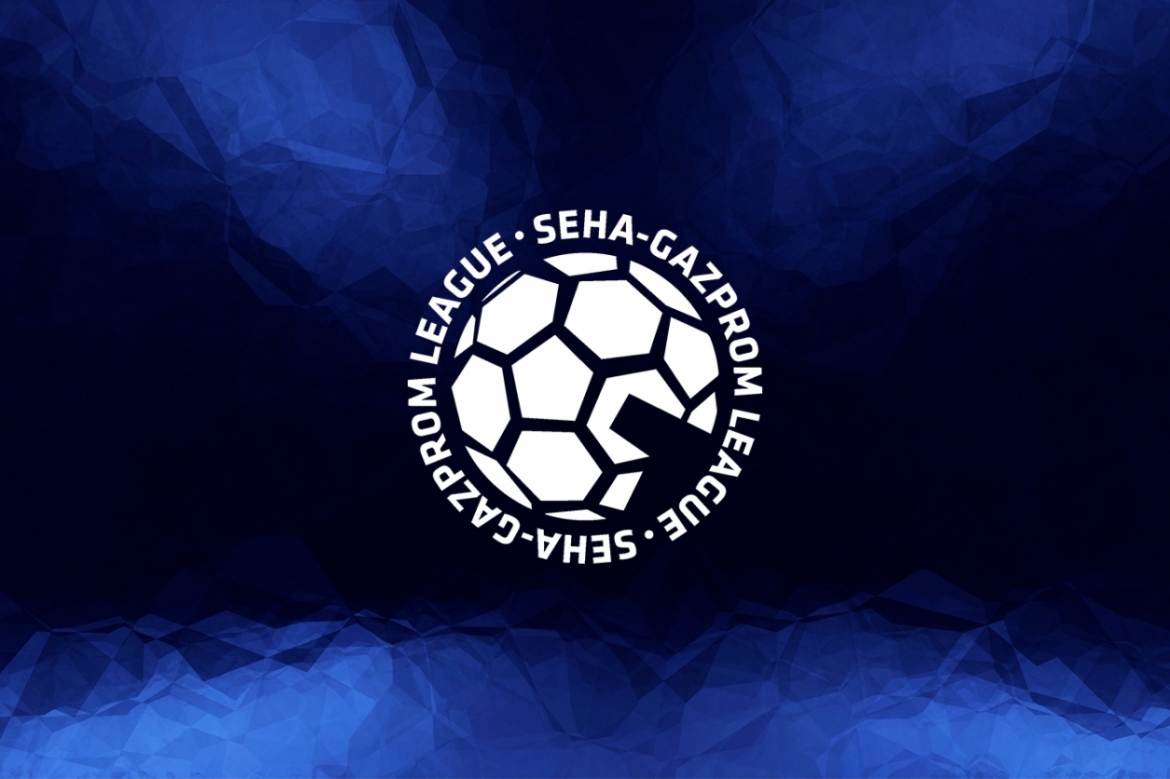
As we enter into the new decade of the SEHA – Gazprom League, its visual identity was refreshed just before the start of the 11th season. Clear guidelines have been set on how to present SEHA identity throughout visual and textual elements and any type of communication.
The main changes in the refreshed visual identity are the usage of new graphical elements and refreshed SEHA – Gazprom League logo. The dark blue colour which prevails in all brand elements, comes from the SEHA symbol, colorful handball with a timeout sign, which is the basis of the corporate logo. All other colors from the symbol will be used as highlight colours.
The competition logo is now available in white, blue and black version, with blue and white version being the primary ones and used on all graphic work, depending on the background colour.
Additionally, the main claim experience handball has remained the focal point of communication. The idea behind the claim back in the days was to put an emphasis on the emotions which everyone is experiencing once involved in handball, whether a person is a fan, a player, club representative, or a volunteer.
The refreshed visual identity can already be seen on all digital platforms and soon on all branding materials and in TV broadcast.


